
The Make the Logo Bigger Paradox
Every sign designer has experienced this. A client opens a new boutique and wants a highly visible storefront sign. The designer creates a beautifully balanced mock-up: the store’s name in sleek, illuminated channel letters, centered perfectly on the building’s fascia with plenty of elegant, empty space around it.

The client’s feedback? “Make the logo bigger.”
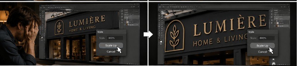
The designer scales it up 20%. The client squints at the proof. “Bigger. Fill the whole space. I want people to see it from space.”
Eventually, the designer scales the letters until they are practically scraping the roofline and the awning.
It looks less like a high-end boutique and more like a screaming ransom note. The client loves it. They sign the proof. Then, the permit expeditor takes the drawings to the city.

What the client didn’t know is that cities have strict zoning ordinances. Municipalities calculate allowable sign area based on linear storefront footage (e.g., 1.5 square feet of signage per 1 linear foot of building frontage). The giant, space-station-visible logo gets immediately rejected by the city for being 300% over the legal size limit. Furthermore, designers know the secret of negative space. A sign that is slightly smaller, with breathing room around it, is actually much easier for the human eye to read at 50 MPH than giant letters crammed into a tight box. The client ends up with the designer’s original, balanced concept anyway—courtesy of local government codes.
Comments (0)
No comments yet. Be the first to comment.